

I would have failed every design class I took in college if I submitted that. Why such wide kerning? Why lower case but upper G? Why so round? Why so completely unreadable at a distance because of micro serifs? There isn’t one good design element in this.
It doesn’t say “car” at all either; no elegance or prestige. The old logo was sexy. New one looks like a logo for bottled water or something.
Edit: it’s like going from James Bond to
Austin PowersInspector GadgetAustin Powers has style. Crazy 60s style but style.
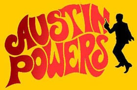
Ya, I wanted to use a bland spy but there aren’t any-- I was going to use the Spy vs Spy guys because they are the most generic-looking, but ultimately I kept Powers because while he is stylish and fun, he is also really immature and the logo looks immature to me.
I think they want people to focus on the “agua” and the j and r are just little accents on it like its word art rather than a logo. Like, I literally picture the marketing weirdos at the meeting going off like this.
The “a” is the worst part for me. You can’t see those little stubbs at a distance. So it reads JoGuor at a distance. They didn’t just fail to create a good logo, they failed to preserve the name. One bit of advice I always give is “imagine this logo on the back of a golf card or a Pride brochure. If the logo isn’t crisp and readable in black and white in a 1/2 inch square then it sucks.” This design fails that test. Not just because of the messed up “a” but the wide spacing makes those unreadable "a"s even smaller than if the letters weren’t so widely spaced.
It’s not joguor?
It might just be depending on how far away you are
Top looks like it belongs on a nice sports car.
Bottom looks like you can find it on a new Multipla.
That font is awful. The G looks completely unrelated to any of the other letters.
The G looks completely unrelated to any of the other letters.
I see this, since half of the letters appear to be uppercase, and the other half lowercase:
JaGUar
Yeah, I see that, too, but at least everything else is all smooth curves. The hard angle on the g makes it stick out as super different.
JaGUar
Maybe they want everyone to pronounce it with heavy sarcasm and mockery.
Bottom text looks like it belongs on some short-lived product for flavoring water or a gas station energy drink.
/uj Technically this is their new logo:
J a G U a r is just their new typeface (I think that’s the name?); and apparently/allegedly is to make the pronunciation closer to UK English, rather than American.
Either way, though - it’s still…
/j
…pReTtY fArKiN’ sToOoPiD.
They went from luxury car company to mediocre smartphone brand
Jaguaren’t
That looks like marketing, let their six-year-old design the logo. Half the letters or lowercase and half are uppercase.
Their logo doesn’t have a jaguar and their car commercial doesn’t have any cars. Fuck it, whatever
Changing things for sake of changing things. Like Microsoft with every moronic “update”.
They’re trying to impress investors with ‘serious’ design, not stand out with a unique one
Nothing says “serious” like mixing upper and lower case letters yet keeping them all the same height, so it looks like a third grader wrote it
Yeah, it DOES look like shit, but tiger-less and safe shit
Soon there will be no color, no originality.
Just a single font to use everything will be homogeneous and consolidated. Minimal, inoffensive and focused grouped to appeal to everyone and also no one.
Movies, music, games, brands.
You’re all making fun of it but this new style did exactly what it intended to do. Everyone is talking about them now.
JOGUOR
JaGUar
oversimplifying logoes and stuff makes me rage, especially this


![You know what, fuck you [un-Jags uar icon]](https://lemmy.world/pictrs/image/c1e5def3-4f79-4ee4-b74e-3672dac8df0e.png)