It’s been at least 3 hours now. Which was it?
I had the yes set to white and the movie started over.
You should post this in the group assholedesign. This is genuinely so bad it’s infuriating.
Really? Literally everyone in this thread figured it correctly as yes. So it’s really not that bad.
I didnt
Alright I’ll reiterate my statement to exclude people who are literally blind.
Well that was unnecessary. Maybe go back to reddit
Welcome to the Internet
I was on the Internet before the www existed. Quit excusing your shitty behaviour
No you weren’t.
Kind of more crappydesign than assholedesign, but yes.
Press left. If nothing changes, then Yes is selected.
It looks like the ui designer didn’t know how scaling works for images
If you’re genuinely asking… the yes option. But that is indeed a shitty ass UI.
My answer comes from the “thumb print” effect - that radial shadow pattern is supposed to remind the user of their finger partially blocking the light on an illuminated button.
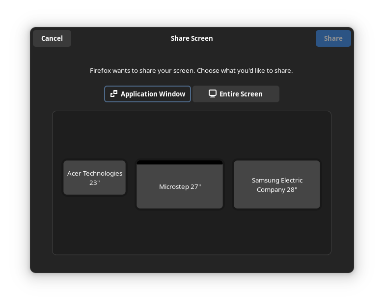
The one that always gets me is GNOME’s screen sharing portal.

There is this outline around the “Application Window” tab which makes it seem selected. I use this UI multiple times a week and I need to pause for a sec every single time. I always think “I want to share a window”, “oh it is already selected” then stare at the monitors for a while before I realize why I can’t understand what I am looking at.


