
I’ve been making more music than I usually do lately. Here’s my most recent track: https://on.soundcloud.com/zNnZQUjdG2V4H3Hz8


I’ve been making more music than I usually do lately. Here’s my most recent track: https://on.soundcloud.com/zNnZQUjdG2V4H3Hz8
Just as evil are the pages that don’t let you select text or pictures for copying.


Oh boy who could have predicted?


Okami just had its sequel teased after about 15 20 years. I’m excited to see what they do with it.
edit: 2006 was not 20 years ago! :(


Just Cause 3. Just a total blast to go swooping around in the wingsuit and blowing up bases.


I’m in almost the exact same position. Next year is the start of my project to start making videos out of my collection of gadgets and the idea is to organize them as I go through them.


This sounds absolutely terrible. So everyone gets their own separate education that no one is vetting? And what you learn sounds like it could be totally different than the next person.
We’re fucked if this is how kids are being taught going forward.


You’re right. I’m thinking of malaprop.


Spoonerisms Malaprops are when a character chooses a similar sounding but wrong word for comedic effect.


I got to see this live and holy crap what an amazing race! I thought for sure there was about to be a red flag when they were 3-wide. Absolutely incredible to see them up close.


Monkey brain:
Happy? I should smile…
Smile? I should happy…


He who stands on toilet gets high on pot.


“Honey. You’ll never guess what they asked me to do at work…”
I love that her reaction is left to your imagination in this one.


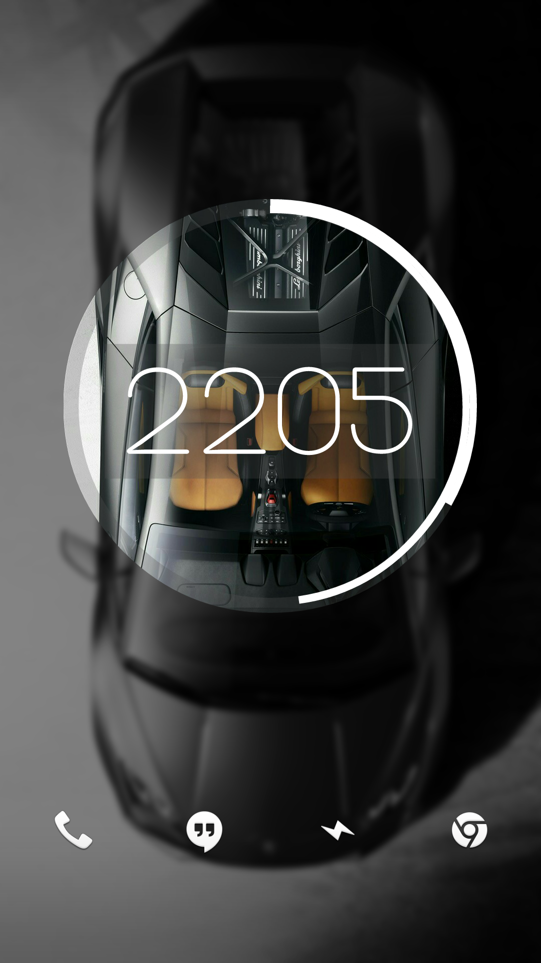
Right on. I’ve moved onto a dirty iPhone since, but here’s a screenshot of my super old Android setup back from when Material was new. After Android took out all the fun stuff custom ROMs could do, I sort of fell out of love with Android.

I had a cool feature at one point where it started out looking like this and unlocking it would make the circle expand and the background would show in full.
Man, I miss early KLWP


Any time! I’m a graphic nerd with none of the book learning, but I do work at a screen printing shop, so I have some intuitive understanding of logo/icon design, but don’t have the theory to go with it.
In other words, I have wildly subjective opinions that I’ll randomly dig my heels in on. (Sometimes when I have no idea what I’m talking about ha!)


Take these icons, add one more layer of simple gradient shading: perfection
For example, GIMP’s icon looks especially bad here to me. If it had just a hint of black shading, it would look massively better (imho).


I think I’m in the same place. I really like the idea of icons having depth. Modern icons are very versatile, but lack personality. Having some depth gives them some weight, but never really liked the emphasis on curves and gradients. I think a mix of original Material design and just a hint more depth would be the perfect sweet spot.

Total hidden fem I watched recently called Kevin Can F— Himself. It’s a unique concept where any time the titular at character is on screen, it’s filmed like an 80’s sitcom. As soon as he leaves set, it’s a stark drama.
Really unique concept and haven’t seen anything like it before. 2 seasons with a proper ending. It’s currently on Netflix.
Another better known one is Yellowjackets. Although, major gore/stress/horror warning on that one.
I’m definitely not with majority on this. Every city I’ve lived in, I can navigate decently well by major streets, highways, landmarks, etc. I think it came with the fact that I moved around so much growing up. I always want to feel like I know the area, so I’ll study a map for a couple hours whenever I first move in.