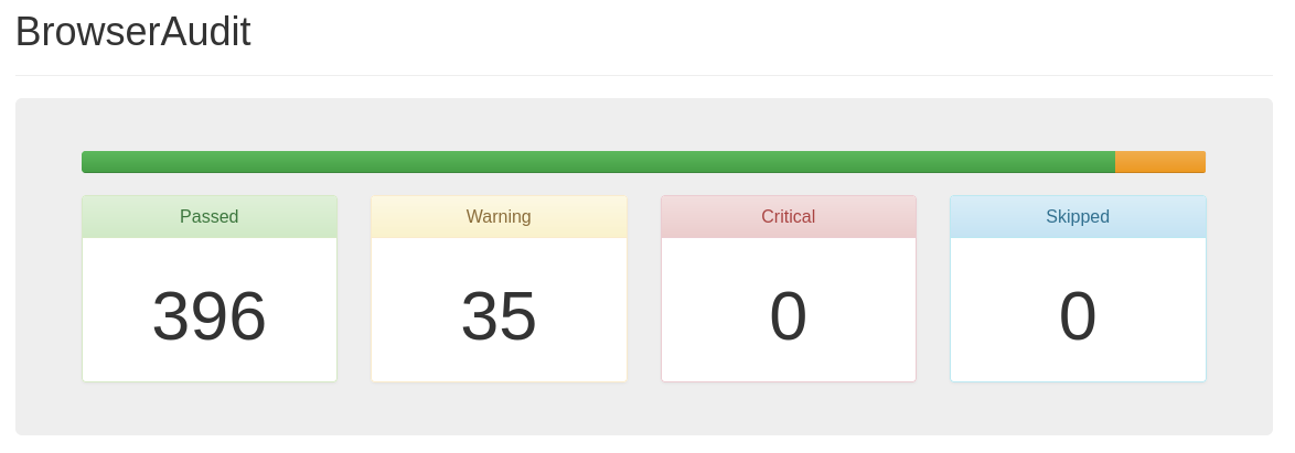
Always like to test out default installed browsers against browseraudit.com.
Score :
- Passed : 396
- Warning : 35
- Critical : 0
- Skipped : 0

Not too shabby
First I’ve heard of browseraudit, thanks for sharing!
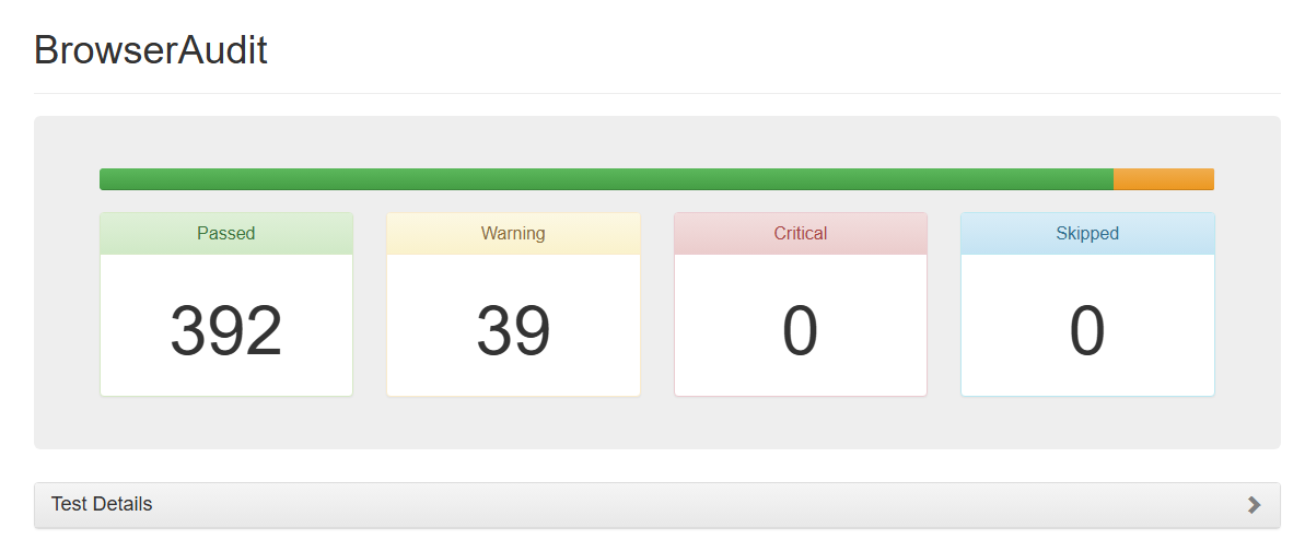
EDIT: For comparison I got the same scores on Firefox (duh) and the following on Edge.
Score :
- Passed : 392
- Warning : 39
- Critical : 0
- Skipped : 0

Bonus! Browserbench.org speedometer 3.0 scores:
- Firefox; version 132.0.1 (64-bit)): 13.9
- Firefox nightly; version 134.0a1): 18.6
- Zen; version 1.0.1-a.17 (Firefox 132.0)): 17.6
- Edge; version 130.0.2849.68 (Official build) (64-bit): 19.8
Been using zen for the last month or so and it has been pretty good. I went from using super locked down librewolf to using zen. It is not as private by default but can still be tighten down and with proper support for profiles you can compartmentalize it.
It does break and change a lot since it is in alpha but I used to be an arch user so honestly it doesn’t bother me too much.
I’m on LibreWolf. What made you switch?
On top of making an effort to be less paranoid, I have also been trying to organize my ADD and having multiple workspaces with vertical tabs really helped me. I have a profile that is manually locked down like librewolf so I am still pretty secure when I need to be.
I do still have librewolf as a backup as my secure clear web browser.
The split view seems really useful. I was actually just fiddling with that on my laptop with two browser windows.
How does this compare to LibreWolf or other Firefox derived projects?
It is not security hardened from what I can tell. Most of Librewolf’s patches could be applied to build Zen with security hardening. Alternatively, patch Zen browser with Arkenfox user.js (upstream project to Librewolf’s security hardened default profile)
Great, it breaks all the interface conventions. How convenient.
I don’t think the sarcasm is warranted here, it offers a standard interface too but augments it with split browsing as an option
It starts with a full screen window, no window controls… so sorry, it pretty much breaks the expected interface.
I was going to write a snarky comment about how that can’t possibly be true… but then I tried it, and well, yep, really not ideal for non-tiling window managers. I liked the general look and feel, but the fullscreen by default does seem to be a big “no” from me.
signature look of bspwm superiority
deleted by creator


